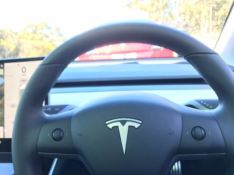
If you started designing a vehicle today that would be built in four years, would you include an instrument cluster? What would you put in front of the steering wheel?
Well, Tesla did this back in 2015 when they began the Model 3 program. And they decided that there was no point in duplicating a range of dials and gauges behind the steering wheel because once vehicles become autonomous, no one will be looking at them anyway.
This insight into the development of the latest vehicle in the Tesla range was provided at an exclusive drive event for the launch of the Model 3 in Australia. FAN was invited to be one of the first people to drive the Model 3 at an event for motoring journalists which included a presentation by one of the team members involved in the development since it was an idea on a whiteboard.
FAN don’t get invited to the same events as the ‘real’ motoring scribes. As fleet specialists we come in on the third or fourth day of a big launch after the mainstream media have had their fun. So to be one of the first suggests Tesla is serious about making this car its volume model and fleets are part of the equation. When I asked about deliveries, the Tesla spokesperson advised that if I ordered in August, I would be driving it by October. Try getting a Hyundai Kona EV this quickly.
First impressions – it’s definitely a Tesla. It has the DNA of design and style. They are not normal cars. From the ground up they are designed from a different starting point and this can be felt in every aspect. This is what makes them cool. And this is why I’m now boring friends and colleagues about how good it was.
The Model 3 is a luxury car in the medium segment which reflects in the price. Like the other Tesla models, if you look close and try to find faults you’ll notice the refinement and quality isn’t as good as a traditional luxury manufacturer. But this is using the experienced and skeptical eyes of a car reviewer. Most buyers wouldn’t notice it.
The design vision for the Model 3 was linked to space. Just like with airline travel, the more space, the more luxurious the experience. The lack of instrument panel and fan vents creates a minimalist look that allowed the design team to create a smaller dash and move the front seats forward. This created more space for the passengers in the front and back.
On the steering wheel there are only two buttons. The other car I’m currently reviewing is covered with buttons on the front of the wheel and there are more buttons on the back. Traditional manufacturers have raced towards giving drivers control of everything at their fingertips which is great. Tesla does it in a simple way which is smart considering they will be obsolete once the car is allowed to drive itself.


